The Useful Tension Between a Grid and a Hand-Drawn Line
Use a grid and hand-drawn line to balance order with movement, placing irregular marks where they can stand out without making the composition feel disconnected.
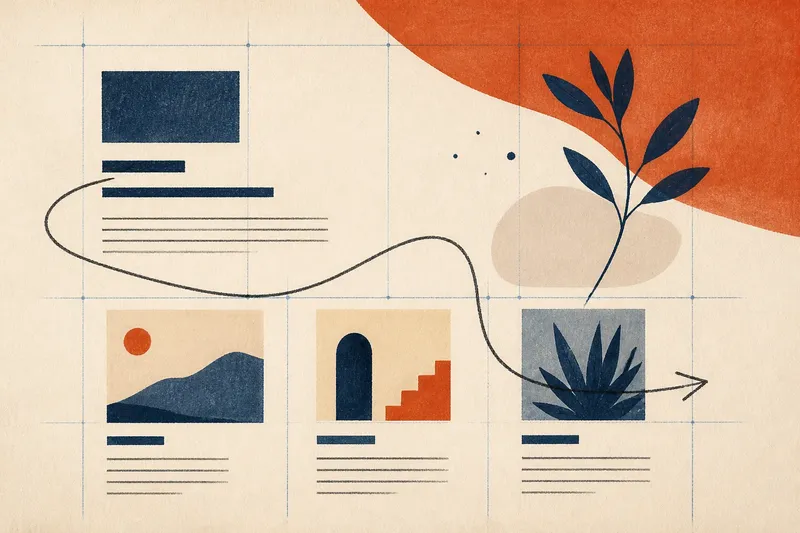
The most common mistake with a grid and hand-drawn line is letting both compete everywhere: the grid becomes a cage, while the line looks like an unrelated flourish. That costs the composition its sense of purpose. A better approach gives the grid a steady role and lets the irregular mark interrupt it selectively, so the contrast feels connected rather than accidental.
This pairing works in a poster, a book page, a sketchbook spread, or a small mixed-media piece. The grid provides repeatable spacing; the hand-drawn line brings variation in direction, pressure, and contour. The practical task is to decide what the grid organizes, what the line changes, and what visual cues link them.
Choose the grid’s job
Begin with the content, not with a ruler. Decide what needs order: perhaps a heading, a cluster of small images, a caption, or open space around a central drawing. A grid is a set of guides for aligning and spacing these elements; it does not have to be visible in the finished work.
On paper, lightly mark a few vertical and horizontal guides in pencil. In a digital document, use guides or a layout grid in an app such as Adobe InDesign, Affinity Publisher, or Procreate. Choose a structure simple enough to support the content: a few aligned columns or a loose row of anchor points can be more useful than a dense lattice.
Set one or two clear alignment decisions. For instance, align the left edges of a title and caption, or place several image areas along a shared baseline. Leave other edges free if the subject needs room. A grid that dictates every placement can make the line feel like decoration added after the fact.
Make a quiet structure
Before drawing the expressive line, place the main elements against the guides. Keep the spacing consistent where repetition matters, but vary the amount of open space where the composition needs emphasis. The grid should establish a rhythm the viewer can sense, even if no grid marks will remain visible.
Think of the grid as a beat rather than a set of boxes. Repeated gaps between small shapes can create a calm pulse; a larger pause near the title can make that area feel important. If every interval is identical, the composition may feel mechanical. If no intervals relate, the line has little order to push against.
For a handmade result, use a light pencil or a removable ruler mark, then plan which guides will be erased, covered, or retained. In a digital file, keep the guides on a separate layer and lock it while arranging the other elements. This keeps the structure available without forcing it into the final image.
Draw with a purpose
Now choose the line’s role. It might lead the eye from a heading to an illustration, outline one form that breaks the grid, or connect several separate elements. Give it a route and a reason to change direction. A wandering line can still feel intentional when it responds to the composition around it.
Use a tool that makes the kind of irregularity you want. A soft graphite pencil can vary in darkness with pressure; a fine felt-tip pen makes a more even mark while keeping a visibly human contour; a dry brush can leave broken edges. Try a few marks on scrap paper first, because the tool’s texture affects how strongly the line contrasts with the grid-based forms.
Draw the line as a distinct gesture rather than tracing every grid edge. It can cross a guide, bend away from an alignment, or pass through open space. Keep at least one relationship visible: let the line begin near an aligned element, turn at a shared anchor point, or end in a space the grid has deliberately left open.
Say you are making a small event poster with a title aligned to the left and three compact information blocks arranged in a row. You draw a loose pencil curve from beside the title, let it dip through the open margin, and bring it toward the final block. The blocks retain their orderly spacing, while the curve creates a route between them; if its endpoint meets the block’s edge or points toward its text, the mark feels related to the layout rather than pasted on.
Control the contrast
Contrast is a difference the viewer can notice, such as straight against curved, repeated against irregular, or measured spacing against a shifting mark. Too little difference makes the line disappear into the structure. Too much can split the composition into unrelated zones.
Adjust one quality at a time. If the line is already highly irregular, keep its color close to the other marks. If its color is vivid, make its route simpler. If it is thick and dark, let it appear only where the composition needs emphasis. This keeps the line expressive without asking it to compete with every title, image, or caption.
Also consider how often it appears. A single expressive route can act as a focal gesture, while repeated line motifs can link several areas. Repetition need not mean copying the same curve; a related bend, angle, or stroke quality may be enough. Avoid adding new marks merely to fill each empty grid cell, since the quiet areas help the active line register.
Check the relationship?
Should the grid stay visible?
Only if its marks contribute to the finished composition. A visible grid can suit a technical, architectural, or deliberately diagrammatic feel; otherwise, use the guides to align elements and remove them from view. The hand-drawn line can then provide the visible trace of the underlying order without showing every guide.
How can I keep the line from looking random?
Give it a clear starting point, destination, or point of contact with another element. Its contour can wander, but its placement should answer something in the layout, such as a gap, an edge, or a change in direction. If no relationship is apparent, revise the route before adding more decoration.
What if the line overwhelms the grid?
Reduce one source of visual weight: lighten the mark, shorten its route, simplify its bends, or leave more space around it. Keep the grid’s strongest alignments intact so the reader can still sense the composition’s structure. Make one adjustment, then look again before changing another quality.
Can I draw digitally and keep an organic feel?
Yes. Use a pressure-sensitive brush or a slightly textured pencil preset, and avoid smoothing the stroke until every small variation disappears. Keep the grid on a separate guide layer, then compare the line at the same view size as the other elements; a mark that looks subtle close up may dominate when the whole page is visible.
Review the whole page
Step back from the surface or zoom out until the composition appears at its intended viewing size. Check whether the eye can find the main element, notice the line, and return to the ordered parts. If the line attracts attention but gives no useful direction, shift its endpoint or shorten the gesture.
Then inspect the structure without the expressive line, if possible. Temporarily hide the line layer or cover the mark with scrap paper. The grid-based arrangement should still hold together; the line should enrich that arrangement, not rescue a layout whose alignment and spacing are unclear.
Finally, inspect the work close up for practical distractions: leftover pencil guides, a line that accidentally touches an unrelated edge, or a crowded crossing where several elements meet. Remove or revise only the marks that weaken the intended relationship. The useful tension between a grid and a hand-drawn line depends on a clear structure, a purposeful interruption, and enough restraint for each to remain legible.
When you make another composition, keep the grid’s job specific and the line’s route responsive to the space. That decision is more useful than a fixed rule about how irregular a mark should be: the right amount of contrast is the amount that helps these particular elements belong together.