The Myth That a Limited Palette Must Feel Dull
A limited palette can feel vivid without extra hues. Use value shifts, selective emphasis, and varied color relationships to give each element a clear role.
The common mistake with a limited palette is treating fewer colors as fewer choices; the result can be a flat image that costs the viewer a clear path through the composition. A limited palette can feel lively when values and emphasis do different jobs, even if every color comes from the same small set.
Separate hue from value
Hue is a color’s family, such as blue or orange. Value describes how light or dark it appears. A palette with only a few hues can still hold a broad range of values, giving shapes room to separate and focal points room to stand forward.
Before adding another color, squint at the piece or view it as a grayscale image. If two neighboring areas merge, adjust one area’s value rather than reaching immediately for a new hue. In paint, mix a lighter or darker version; in a digital painting app such as Procreate, check the image with a grayscale adjustment layer.
Keep the strongest light-dark contrast near the subject that matters most. If every edge and object receives the same contrast, nothing leads. A quieter range in the background lets a modest difference in the foreground become noticeable.
Build variety within colors
A single hue can shift in temperature and intensity. A muted blue-gray beside a clearer blue reads as a change in character, though both remain blue. Mixing a color with a small amount of its complement can soften it without introducing a conspicuous new hue.
Surface also changes how a color feels. A broad, smooth wash of ochre behaves differently from a dry-brush mark of the same mixture. In digital work, a textured brush can create a comparable distinction, but texture should clarify the form rather than decorate every area equally.
Try assigning each color more than one role: a dark blue for a cast shadow, a thin contour, and a small accent can connect separate parts of an image. Varying the mark, edge, or area of application keeps those uses from feeling like repetition.
Use emphasis sparingly
Emphasis is the quality that makes one part catch attention before another. It can come from contrast, sharper edges, detail, or an isolated patch of color; it does not require a fresh hue. A small, crisp mark may attract more notice than a large, soft one.
Reserve the clearest edge and brightest note for a specific purpose. Soften less important boundaries with a blending stump in pastel, a damp brush in watercolor, or a lower-opacity brush in digital work. This variation gives the eye a route through the piece instead of asking every area to compete.
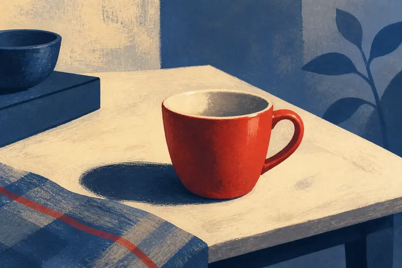
Imagine you are painting a red cup on a table using only red, blue, cream, and black. If the cup, tabletop, and shadow all have similar values and equally sharp outlines, the scene may feel crowded and dull. Darken the shadow, keep the cup’s rim crisp, and soften the far table edge; the same four hues now describe depth and direct attention without adding a color.
Limited palette questions?
How many colors should a limited palette have?
There is no fixed count that suits every piece. Choose a small group that can mix the light, dark, warm, and cool relationships you need, then add a hue only when the subject or intent calls for a genuinely different color role.
Can a monochrome painting still have contrast?
Yes. A monochrome work uses variations of one hue, and its contrast can come from changes in value, edge sharpness, texture, and saturation. Check that the main forms remain distinguishable before refining subtle shifts.
What if the colors look muddy?
Separate areas that are blending together by changing their value, temperature, or edge rather than mixing more pigments into the same passage. In paint, clean the brush between mixtures; in a digital file, compare the color against nearby shapes at the same zoom level.
Should the accent color be the brightest color?
Not necessarily. A quiet color can become an accent when it appears alone, while a bright color can recede if it covers a large area. Decide where you want the viewer to look, then make the surrounding marks support that choice.
Check the composition
Step back from the canvas or zoom out until fine details disappear. Look for a clear main shape, a quieter area for the eye to rest, and enough value difference to keep neighboring forms legible. If the whole piece has equal visual weight, reduce contrast or detail in less important places.
A small thumbnail sketch can expose problems before you revise a finished passage. Use pencil, charcoal, or a grayscale canvas view to map the light and dark masses; if the composition reads there, color can enrich it without carrying all the structure.
The useful test for a limited palette is not whether it contains enough hues, but whether each hue has a distinct task. When a passage feels dull, first look at its value range, edges, and emphasis. A carefully placed change within the existing palette often gives the image more life than another color would.